DataViz for E-learning
Visualizing Knowledge Network for Orgainizations
This project aimed to create a collection of data visualization for Intesa SanPaolo, the leading Italian banking group, to explore the impacts of its training program on the growth of knowledge depth in the corporate. Our team provided an interactive web application for our client as the final deliverable. We first used Gephi to generate static network image, then put together all graphs in a user interface and developed it using D3. The interactive prototype will be used for exploring the value of the current training program and supporting the future development and business plan.
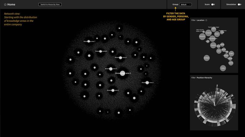
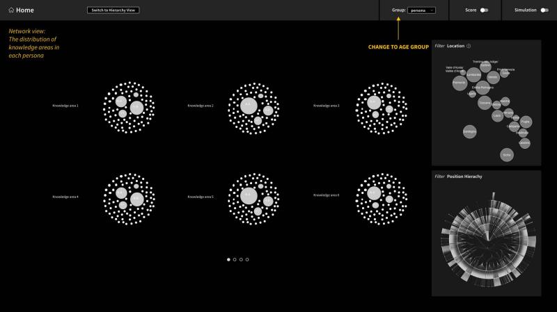
In this application, users can explore the knowledge data within the company and customize the data displayed through visualization. They can get an overview of data and dive into the data through interactions, including scaling, filtering, linking, etc. We integrated the knowledge distribution and the position hierarchy of the bank into the web application by combining two main views — the network view and the hierarchy view — to display the data. The users can switch between two views easily and drill into segments of interest through interactions.
Prototypes & Applications
[Award] Information is Beautiful Awards 2022 Longlist
| Keywords | Knowledge Network, Data Simulation, D3 |
|---|---|
| Instructor | Paolo Ciuccarelli |
| Members | Yuan Hua, Houjiang Liu |
| Year | 2021 |
Design Iteration
In the beginning, we experimented with various visual forms to map the first set of data we received, such as network, circle packing, flow chart, stacked bar chart, etc. The tools we used include Gephi, Raw Graph, and Adobe Illustrator. After exchanging ideas in internal meetings and discussing our ideas with the client along the process, we then narrowed down our focus to network mapping and contour maps to represent the knowledge data and its corresponding attributes. Please view more visuals in the presentation file attached in the Deliverables section.
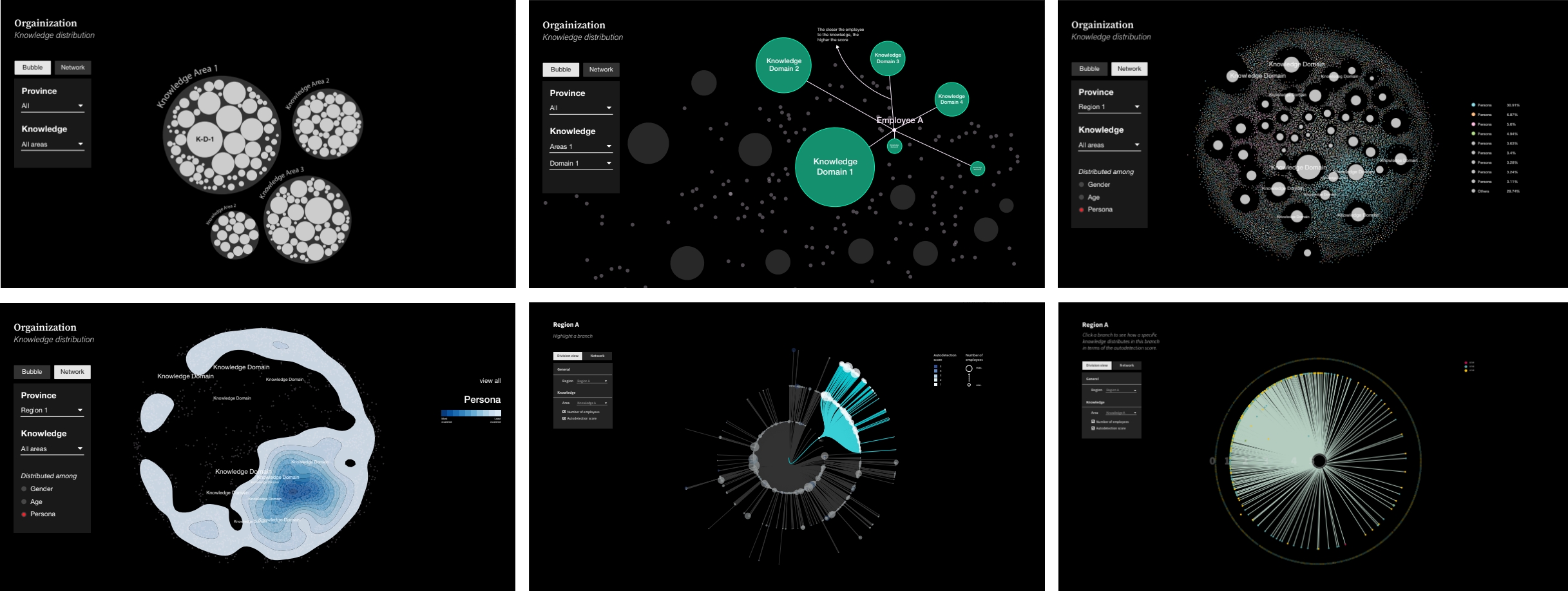
Web Application
To better help our client explore the knowledge data within the company and customize the data displayed through visualization, we proposed designing an interactive web application as the final deliverable. In this application, users can get an overview of data and dive into the data through interactions, including scaling, filtering, linking, etc.We used Adobe Xd to present our interface design and create a clickable prototype for simulation navigation of the application.
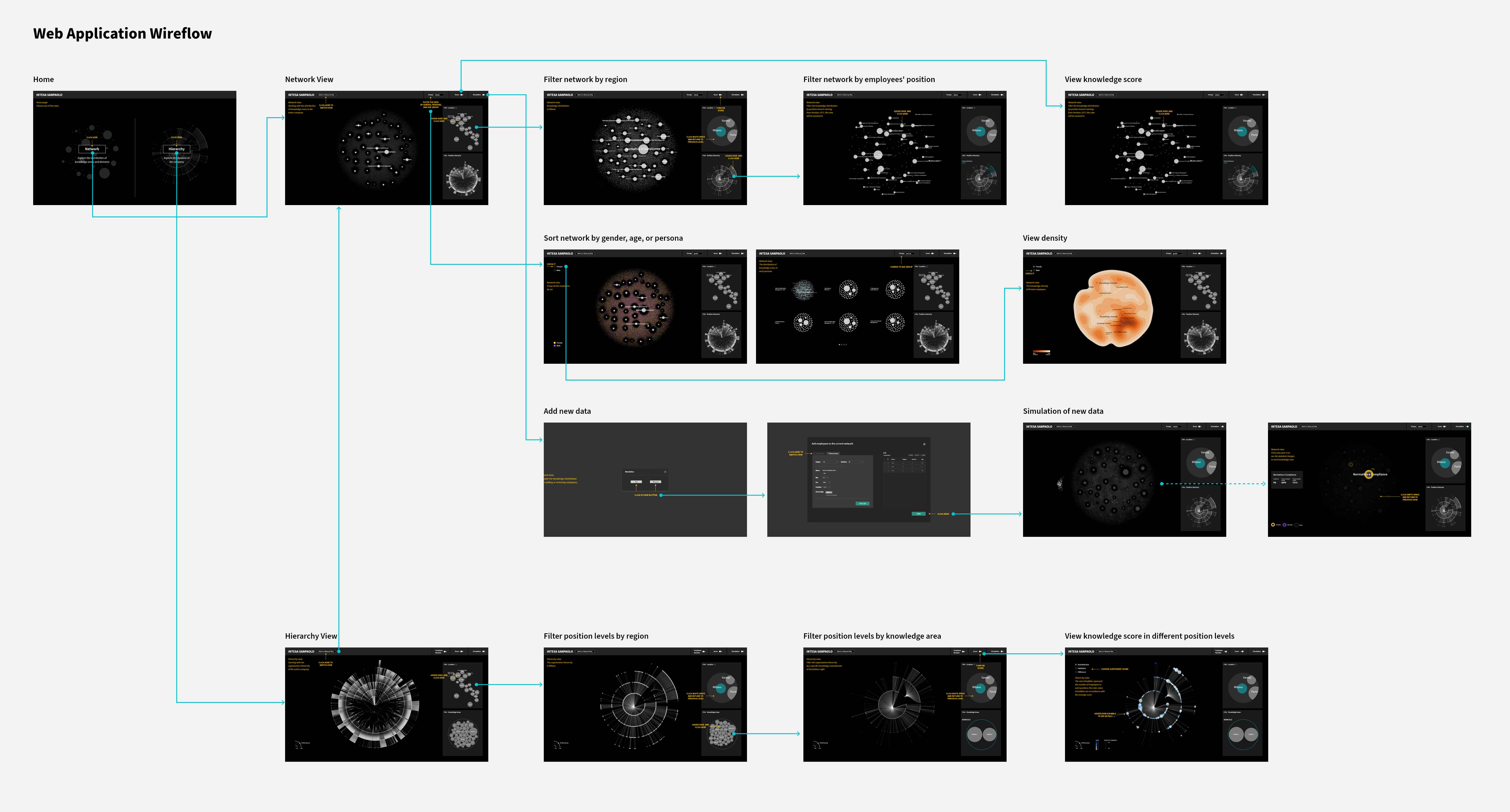
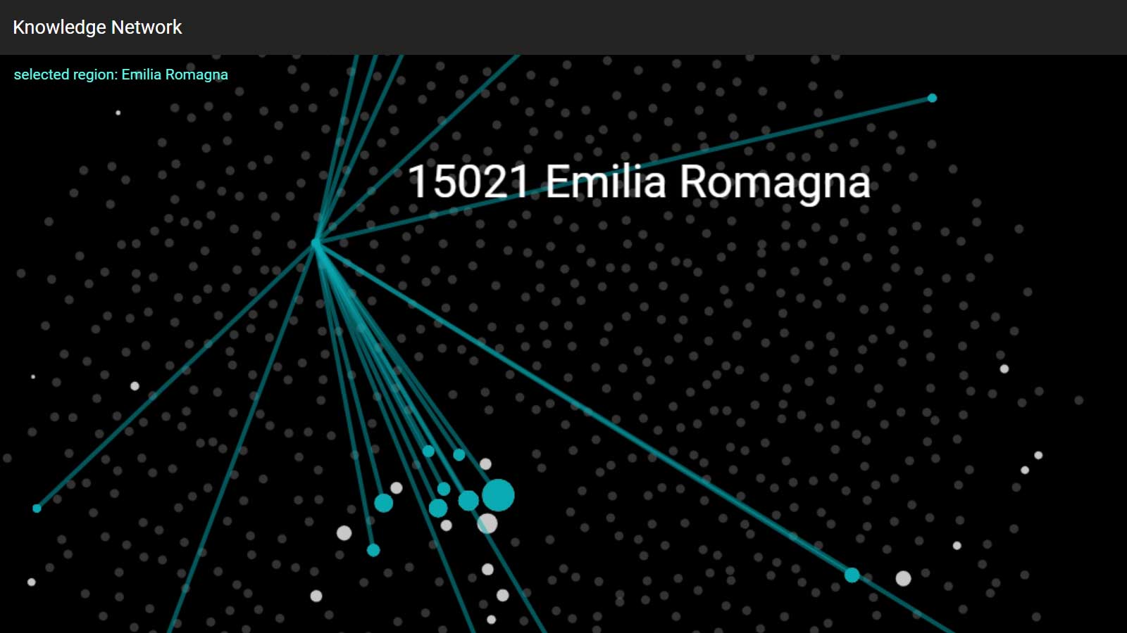
Knowledge Network
The network graph shows different relations between knowledge areas and employees. It visualizes:
- The bigger the nodes the more employees that share this knowledge area;
- The closer the distance between one knowledge node and one employee node, the higher the evaluation score of the corresponding knowledge that the employee gets;
- The cluster of knowledge nodes means some employees possess those knowledge areas in common with others;
To explore the data from different dimensions, including the employees’ demographic attributes and knowledge structures, we add several features so that users can sort or filter the data:
- filter the knowledge network by location;
- filter the knowledge network by position;
- display employees’ attributes in terms of gender, age group, and persona;
- display evaluation scores of each knowledge area;
- simulate changes in knowledge distribution by adding/removing a group of employees.
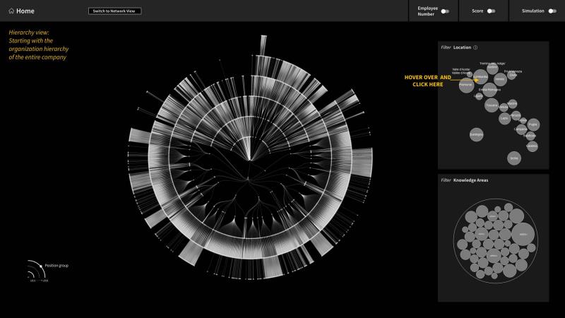
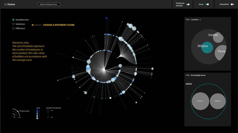
Position Hierarchy
In this view, we chose a radial tree to show the hierarchical divisions in the bank. Users can explore the knowledge depth within each division of the company. Each node represents a position ID. The highest position is the root, and the sub-divisions spread out from the center. We also designed features to let users navigate the hierarchical divisions:
- filter the position hierarchy by location;
- filter the position hierarchy by knowledge area/domain;
- display the number of employees under each position;
- display the evaluation score of the chosen knowledge area/domain under each position
- simulate changes in the hierarchy view by adding/removing a group of employees